
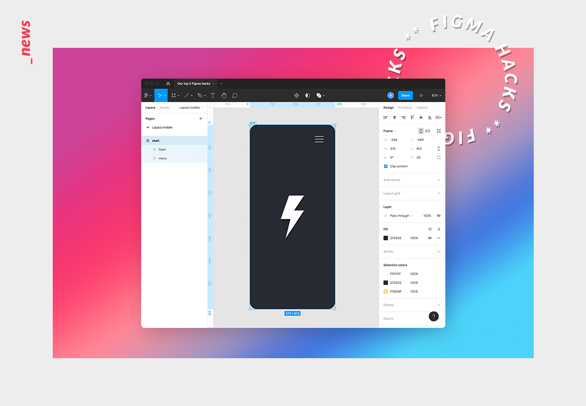
Our top 5 Figma hacks for beginners that make your prototyping workflow take off
Figma is one of the most powerful interface design tools for creating detailed prototypes of websites and apps as well as vibrant presentations. Especially the possibility to work collaboratively on digital concepts as well as the ability to animate layouts in great detail are two insanely big advantages of the programme and bring along great results and lots of fun. However, there are a few things to keep in mind that are likely to make working within the application a lot easier. Below we have summarised the five best hacks for beginners that make your prototyping workflow really stand out!
#1. Structure your work
Structure is the be-all and end-all. If you fail to bring a proper structure into your designs, you will not only make life difficult for others but also for yourself, at the very latest when it comes to animating prototypes. That is why you should set up your layouts clearly and concisely right from the start. This can be done very easily by grouping suitable elements (simply mark your elements and press ‘cmd + g’), naming them properly and start building modules step by step.
#2. Use components & variants
Once you have created your individual modules, you can go ahead and transform them into so-called components (mark your module and press ‘opt + cmd + k’). This has the advantage that from now on you will only need to change the main component if you wish to use it more than once in your designs. This could be useful, for instance, for headers, image sliders, newsletter registrations or similar modules which are going to be used multiple times. If your module is supposed to have several states (e.g. speaking of a simple input form that can be filled or unfilled), you can also create different variants for this component.
#3. Apply auto layout
Whenever layouts need to grow, use the auto layout function (mark two elements and press ‘shift + a’). Every designer knows this exact situation: your layouts are ready to go and a few minutes before the deadline a longer text needs to be inserted. The result: the entire layout is no longer fitting. Therefore, movable elements are supposed to be combined as auto layouts so that they are able to grow intelligently when needed. As a general procedure, it is always advisable to think from small to large and check the results one after another, otherwise, you will get confused very easily at your early stages.
#4. Crop frames & images
A simple hack but nevertheless of great relevance. By holding down the ‘cmd’ key, you can simply drag the edges of your images and frames to resize them as you wish without the content slipping out of place. Absolute must know if you do not want to deform your digital designs.
#5. Animate your user flows
Animation is king. Figma offers you a multitude of different variations and easing curves. However, don’t overdo it! Instead, look at what users really need and, most importantly, how your prototype should behave from a UX perspective. This way you can create great lifelike prototypes that feel like a real product! And on top of that, your developers will be very grateful when they know how the final solution is supposed to behave.
Author:
Andreas Berroth